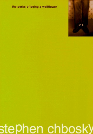
1. The Perks of Being a Wallflower by Stephen Chbosky
I know that this one's a redesign, and all that, but seriously? The cover doesn't say anything about the book at all! :O It's just a plain solid color, with a little words here and there. Boring! I'm glad I saw the cover at the right first; otherwise, I wouldn't even have bothered to try this book/movie!
2. Bloodlines by Richelle Mead
I haven't read this series yet, although I've been hearing lots of great reviews about this. I just can't push myself to read it when the cover's like this. (Yes, I judge the book by its cover :c) I really don't like books with people's faces on it, I don't know why. :o
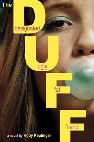
3. The DUFF: Designated Ugly Fat Friend by Kody Keplinger
I don't like how the title was positioned; it looks so all over the place. The words inside the letters seemed a little awkward, too. The face of the girl also looks a little weird. x.x
4. Lock and Key by Sarah Dessen
The cover at the left just doesn't give the book justice; I wouldn't have read this if that was the copy that I first saw. I actually like the cover of the paperback (right)
5. Infinity Glass by Myra McEntire
I like the bottom half of the cover, but seriously. I don't know what that girl is doing in the cover. Her position looks weird and awkward. o.O
6. Isla and the Happily Ever After by Stephanie Perkins
I definitely like the original covers better! The redesigned ones just don't show the cuteness and all of the story. Although, they've started to grow on me, especially the Anna and the French Kiss's!
7. This Girl by Colleen Hoover
Couples kissing on the cover? No, just no! I hate kissing couples as a cover.
8. The Kissing Booth by Beth Reekles
This too! People's faces + Kissing. Nuh uh.
9. Mutilate My Heart by Emily Godwin
I actually don't know what this cover wants to show. :o I haven't read the book yet so I don't know if it's in any connection with the story, but I wouldn't be putting this in my TBR if I didn't see this when I was signing up for blog tours. :o
10. The Fault in Our Stars by John Green
I like the concept of the cover, with all the clouds and chalk-y fonts. It looks adorable, and I'm a sucker for cute stuffs (not to mention it's blue). However, I think that this cover doesn't really show what the book is about. I read this book because my friend recommended it to me, without reading the synopsis. I thought that this book's of a lighter mood because of the cover design, but I cried buckets of tears here. :o




















 Posts
Posts


